Halden Coffee
A modular label system for an Oslo roastery whose single origins change every six weeks.
- Client
- Halden Coffee Roasters
- Year
- 2026
- Discipline
- Packaging
- Role
- Creative direction, packaging system, illustration
Case study
The brief
Halden roasts in small batches and rotates its single origins every six weeks. Its old bags were printed in runs of ten thousand, so every seasonal coffee shipped in the same generic sleeve with a sticker slapped on top. The team wanted packaging that could change as fast as their menu without blowing up the print budget.
The approach
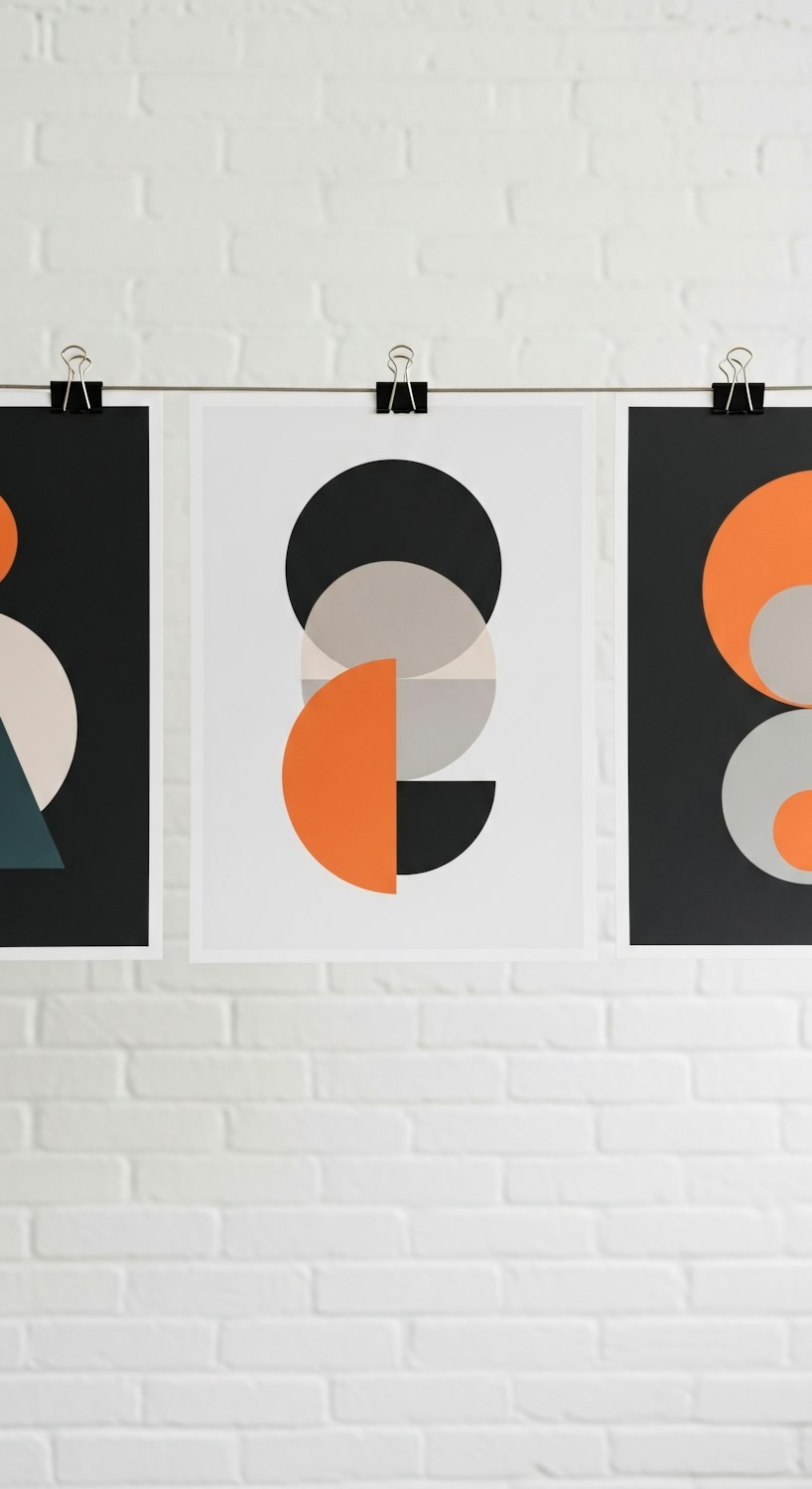
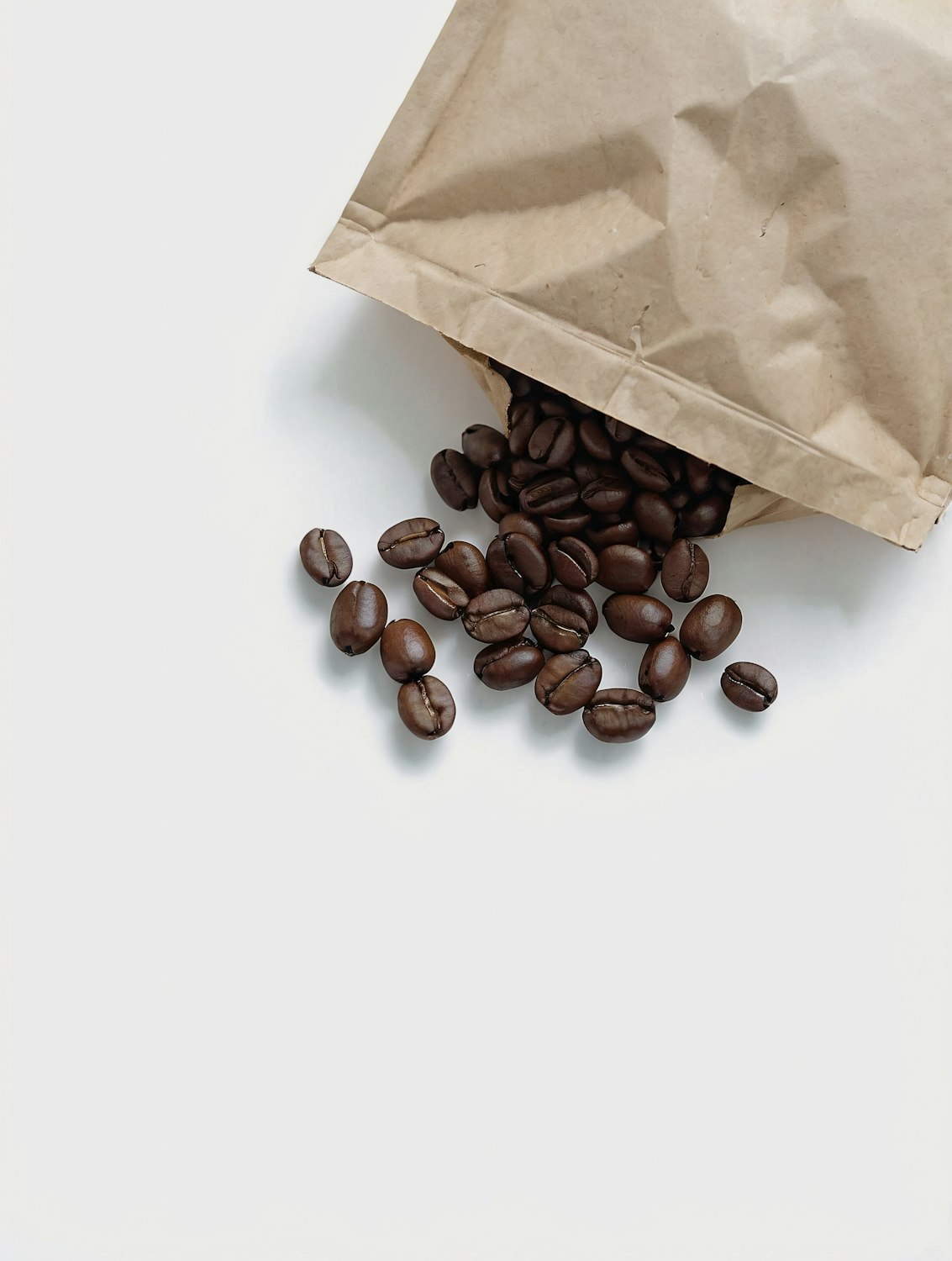
We split the bag into a permanent shell and a seasonal label. The kraft shell carries the Halden wordmark and is printed once a year in a single ink. Each origin gets a narrow label built on a fixed grid: a colour drawn from the farm’s landscape, a tasting-note illustration and the roast details set in a condensed grotesk.
- One shell, printed annually in a single ink
- A label template the roastery team fills in themselves
- Twelve tasting-note illustrations that recombine for every new origin
The outcome
Halden now launches a new coffee in an afternoon instead of a month. Packaging costs fell by a third, and the seasonal labels have become something regulars collect, with a few framed on café walls across the city.