All work
Brand Identity2025
Meridian Type Festival
A poster system for a three-day type festival, drawn from a single variable typeface.
- Client
- Meridian Type Festival
- Year
- 2025
- Discipline
- Brand Identity
- Role
- Identity, poster series, motion guidelines
Case study
The brief
Meridian brings type designers, students and studios together for three days in Porto. Every edition used to have a different look, so the festival never built recognition from one year to the next.
The approach
Instead of a logo, we designed a behaviour. The identity is one variable typeface stretched along its width axis to fill any format, from a stamp-sized ticket to a twelve-metre banner. Weight follows the clock, so the programme literally gets bolder as the evening sessions approach.
- A width-responsive wordmark generated for every format
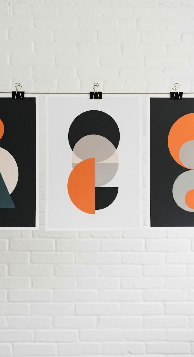
- Forty posters produced from one flexible template
- Motion rules for the screens across every venue
The outcome
Tickets sold out three weeks earlier than the previous edition, and the system is now in its second year with no redesign needed.