All work
Brand Identity2024
Lumen Mineral Care
A calm, mineral identity for a skincare brand that never uses more than three ingredients.
- Client
- Lumen Mineral Care
- Year
- 2024
- Discipline
- Brand Identity
- Role
- Naming support, brand identity, packaging
Case study
The brief
Lumen makes skincare with three ingredients or fewer. The founders wanted to stand apart from the clinical white of their competitors without slipping into the usual wellness clichés.
The approach
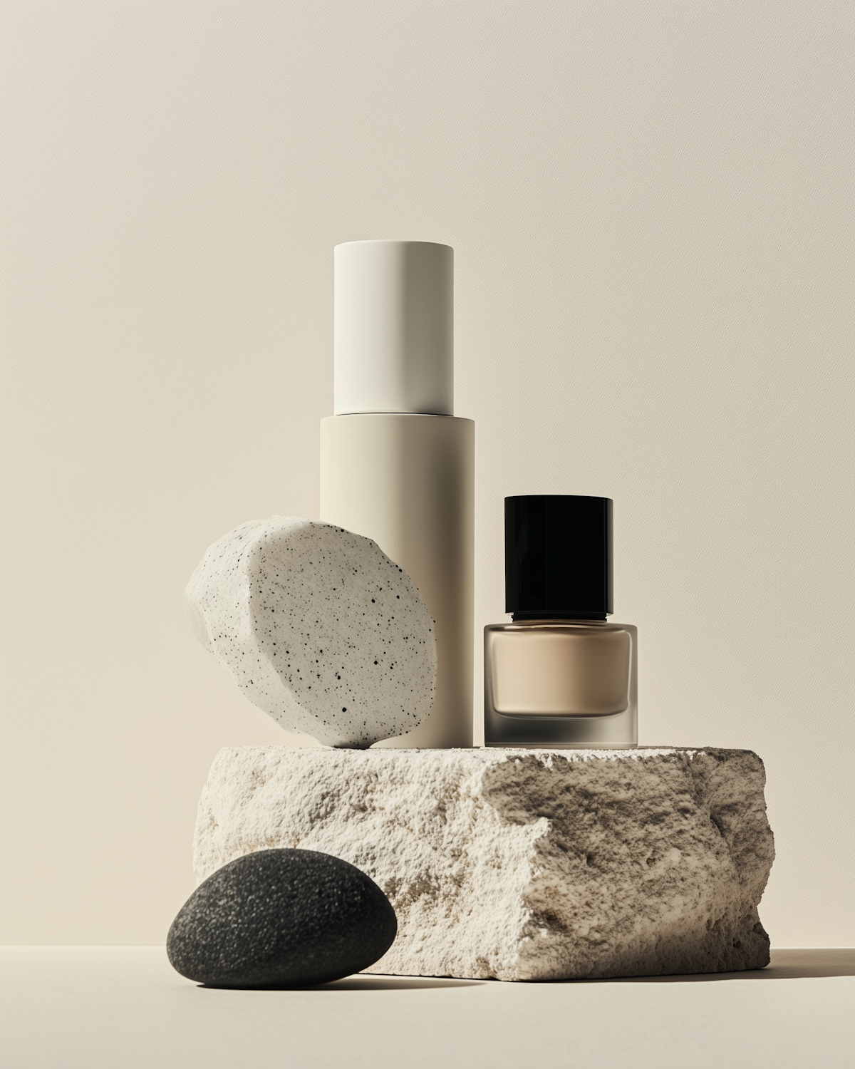
We started with the minerals themselves. The palette is drawn from raw clay, sea salt and volcanic stone. The wordmark is cut from a single geometric stroke, and each bottle carries nothing but the product name and its ingredient count, set large enough to read from across the bathroom.
- A wordmark built from one continuous stroke
- A palette sampled from the brand’s three source minerals
- Packaging that prints with two inks on recycled stock
The outcome
Lumen launched in forty independent stores across Europe. Buyers repeatedly named the shelf presence as their reason for stocking a brand with no advertising budget.